THE DESIGN INDUSTRY TENDS TO THROW AROUND TERMS LIKE “ENVIRONMENTAL DESIGN,” “EXHIBITION DESIGN,” AND “SPATIAL DESIGN.” WE’LL SPARE YOU THE INDUSTRY LECTURE AND SIMPLY SAY THAT ALL OF THESE REFER TO THE ACT OF VIEWING YOUR BREWERY AS AN IMMERSIVE, THREE-DIMENSIONAL BRAND EXPERIENCE.
This oft-overlooked portion of your brand can help tell your story and make your brewery more pleasant to patronize. “Wayshowing” with directional signage combined with thoughtful spatial design fosters better customer service and creates a lasting impression that’ll keep people coming back.
For the sake of this conversation, we’re talking about the public-facing side of your brewery—the taproom, tasting room, restaurant, merch area, checkout counter, etc. There are far more qualified people than us to tell you how to arrange your brew deck and tanks. We’ll also assume that this is happening after your branding has been developed, or shortly thereafter as a part of your foundational design process.
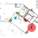
- An early spatial map for North Pier Brewing.
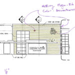
- Big Lug Canteen’s Patio Elevation
North Pier Brewing’s (Benton Harbor, MI), spatial map led to some fun way showing components.
-
1
DEFINE YOUR OVERALL GOALS / DEVELOP SPATIAL MAP
The first thing you need to do is understand how customers will flow through your space. Example: a stripped-back, industrial setup with an emphasis on growler fills will have a markedly different flow than a comfortable brewpub environment that invites groups to settle in and order several pints over the course of an evening.
The best way to kick off this process is with a list of your strategic business objectives and a top-down view of your taproom (you likely already have several of these developed through your planning stage). What should customers see when they arrive? What should they do? How long should they stay, and how much time and money should they spend? The goal is to break the space down into specific zones and identify what should happen at each one.
Common examples can include: main entrance / foyer / host station / seating (2-top / 4-top / communal) / bar / booths / restrooms / private party room / merch & checkout area / patio / growler fill station / brewery proper (for tours)
Next, we’ll identify messaging opportunities for each of these areas. This usually happens in the form of mockups and prototypes to get an idea for what the specific are can look and feel like. This is also important for gathering production estimates.
Some examples can include: murals / custom signage / wayshowing / large atmospheric elements / branded games & other communal activities
Important considerations:
What is my overall concept? How do I want people to use my space?
How many areas or “zones” do we have? (chart these on your floor plan)
What do we want people to do at each one?
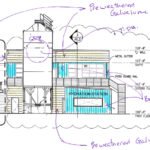
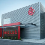
Early concepts and the final exterior design for Big Lug Canteen (Indianapolis, IN).
-
2
SIGN & CONCEPT DEVELOPMENT
After developing your top-down zone map, the next step is to figure out how to best use the space to help your customers become immersed in your brand story. This is where architectural elevations (technical drawings with measurements) and photos come into play. Grab photos (if the buildout is far enough along) and elevations of every area you’ve identified and begin sketching and prototyping different options until you’ve arrived at the best solution.
Important considerations:
How do we tell our brand story?
What tools can we use? (video / audio / large-scale signage / print pieces / interactive elements / etc.)
What sort of production budget are we working with?
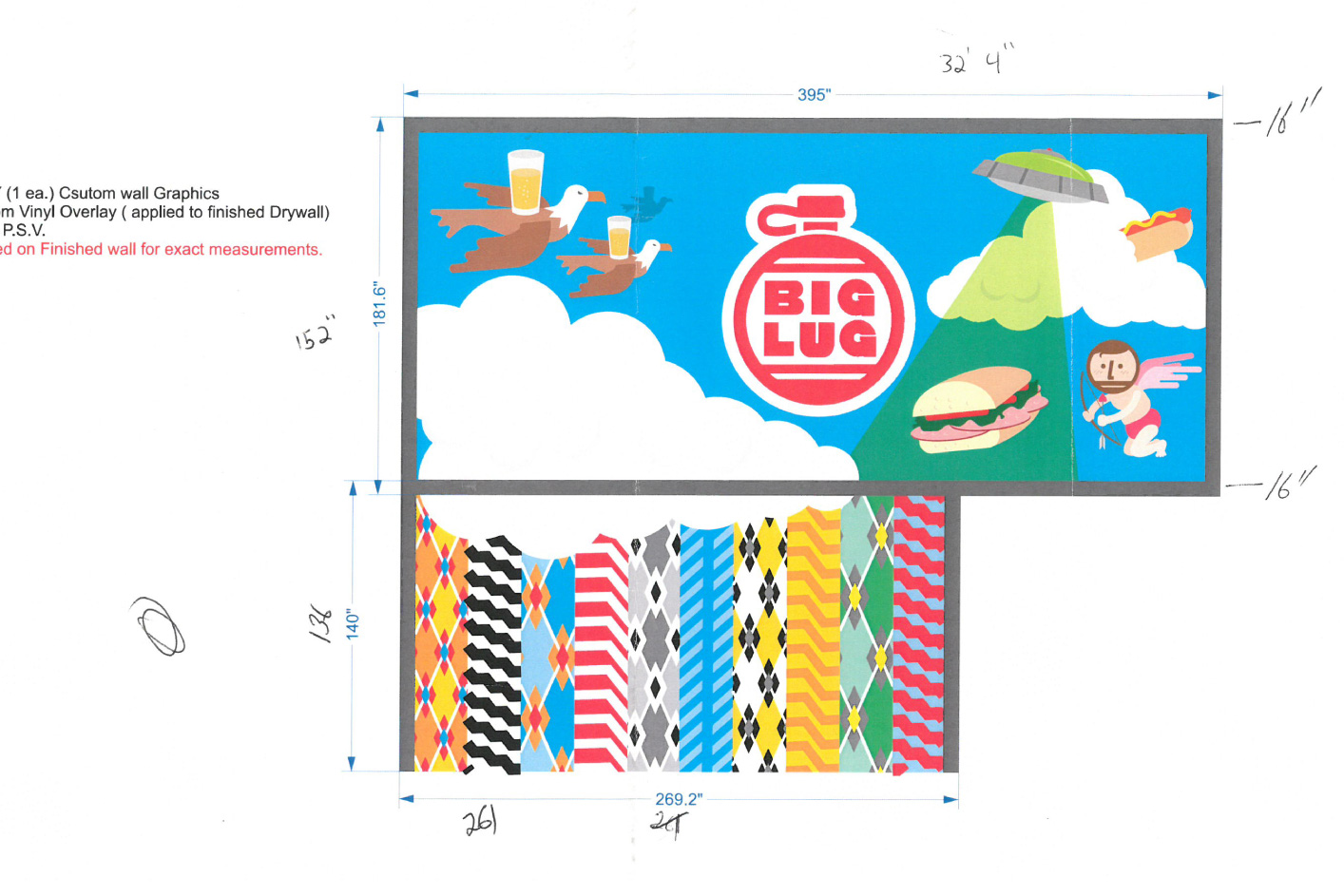
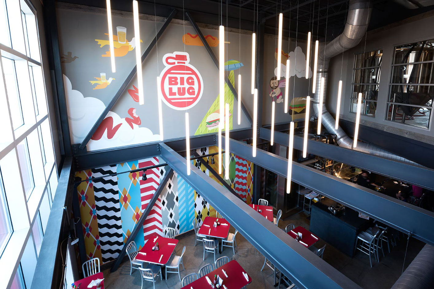
Mural design and production coordination for Big Lug Canteen.
-
3
COMPONENT EXPLORATION & PRODUCTION PLANNING
Once you’ve settled on final design components, you’ll be ready for production. Your creative partners should be shepherding this congruently with the design process itself. Either way, you (or your partners) need to talk to different fabrication and/or production partners to hammer out costs and hash out a timeline to produce and install everything.
Important considerations:
How are these components produced / fabricated?
Figure out logistics: budget / production & installation timelines
Make sure to consider any necessary permitting if tackling exterior signage. This can be a pain to deal with and needs to be considered up front, before you pull the trigger on production. A competent production partner should be able to help you navigate this process.
-
4
INSTALL EVERYTHING
The final step is approving everything for production and coordinating install dates. Your creative partner should coordinate most of the specifics directly with the vendor. On your end, you’ll likely need to make sure they can get into your space when necessary to put everything in place.
Oh, and make sure to view everything through a little finger-picture frame lens when it’s done. You’ve earned it.
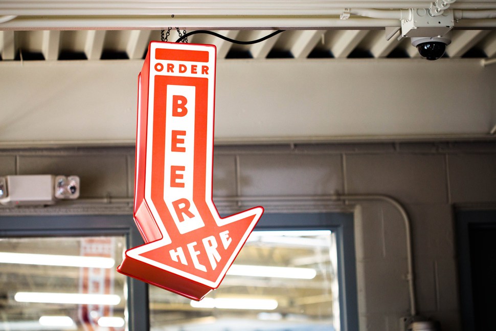
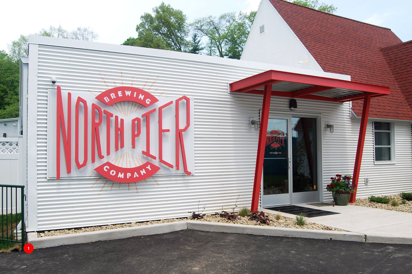
We nearly stole this sign from North Pier Brewing (Benton Harbor, MI) before installation. But upon reviewing our contract, determined that this would be not cool illegal.
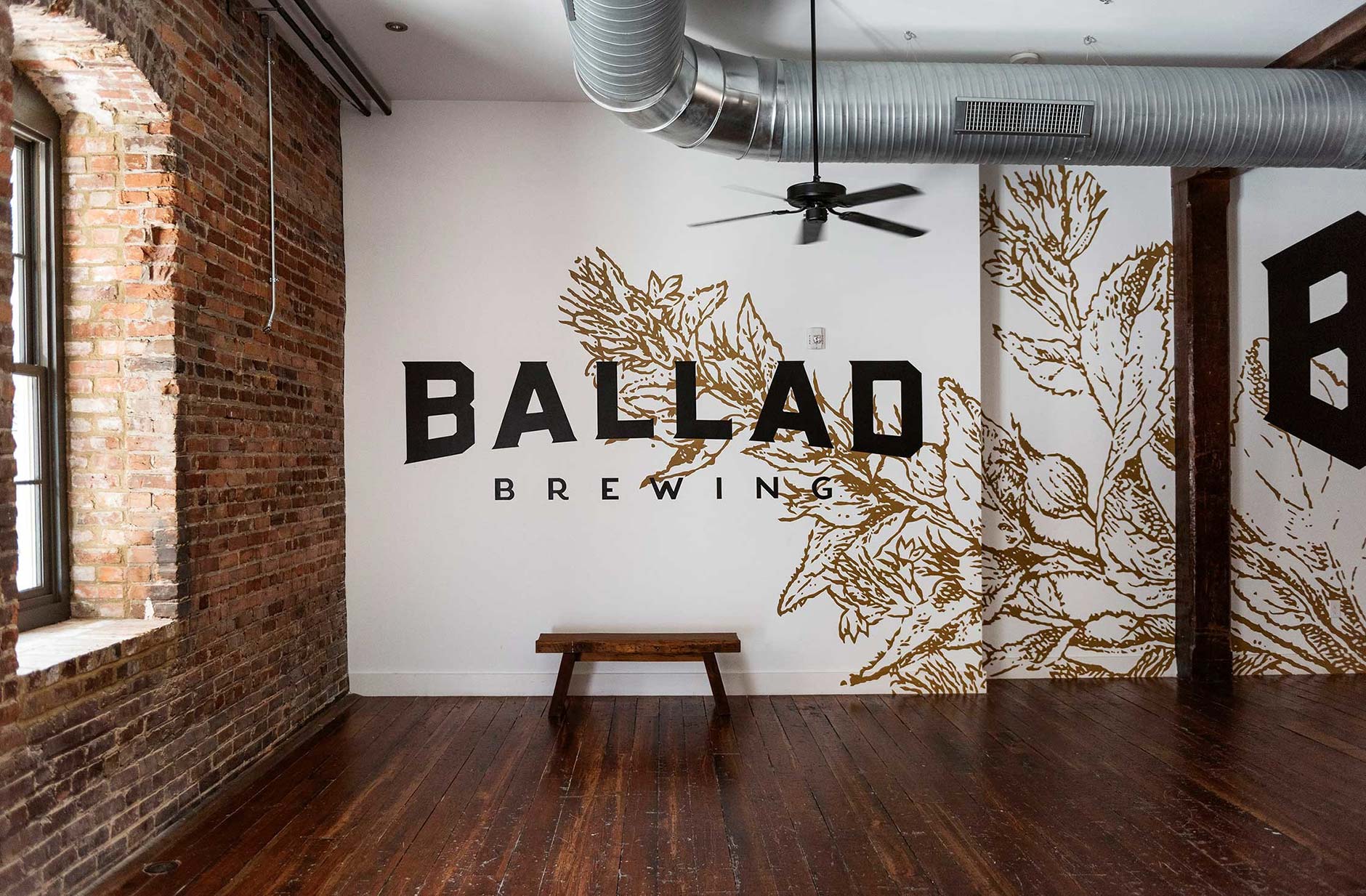
This mural at Ballad Brewing (Danville, VA) lets you know you’re in the right place.
FINAL THOUGHTS
-
1
THIS IS FOUNDATIONAL
It’s likely that you’ll have to shelve some ideas for a later date due to budget issues. But even if that’s not the case, make sure to always consider how you can improve your space and customer experience. Can you make your brewery more inviting? Can you improve peoples’ experience? Environmental design, like branding, is never complete. This goes deeper than simply making cool signage—it’s tailoring your environment to tell your story.
-
2
FESTIVAL KIT
You can apply this same thinking to your festival kit buildout. Try to picture your booth, tent or table from different distances and in different settings. What should attendees do when they come up to your booth? Are they immediately given a sample, or are there opportunities for them to share a photo of your setup on social media? How about when that line starts to build up? Are you doing something cool with your jockey box? What fun ideas can you come up with to reinforce your brand and get people talking?
