LET’S TAKE A LOOK AT WHAT the WEB DESIGN PROCESS FOR A CRAFT BREWERY SHOULD LOOK LIKE.
While it would be fun to discuss the latest web design and development technology and trends, it wouldn’t be very useful because most of what we’d write about would be woefully dated within a few years. So rather than talk about the tenants of responsive web design or weighing the pros and cons of one content management system over another and discussing social media API integration, let’s discuss what the web design process should look like as well as what information you should be thinking about and prioritizing to achieve your communication goals.
Before we get into the design and development process itself, we’ll talk about a few different approaches you may consider for your brewery. These are all driven by your overall concept (example, a brewery that’s big on taproom events could benefit from a calendar, while a brewpub may not have that need). These are by no means off-the-shelf solutions, but they should give you a good idea of how your website can become a relevant part of your marketing plan.
-
1
Lean, brand-forward microsite / splash page
This can be as simple as a logo, a short ‘about’ blurb, and contact info / social media links. This is often used as a temporary placeholder while a more robust website is built out. Some breweries might even be able to get away with using something like this for a few years provided they actively use social media and engage with their audience in other ways.
A benefit of going this route is that it can be done relatively cheaply and quickly. But as with anything that’s cheap and fast, it won’t have the same immersive impact that a more robust site could.
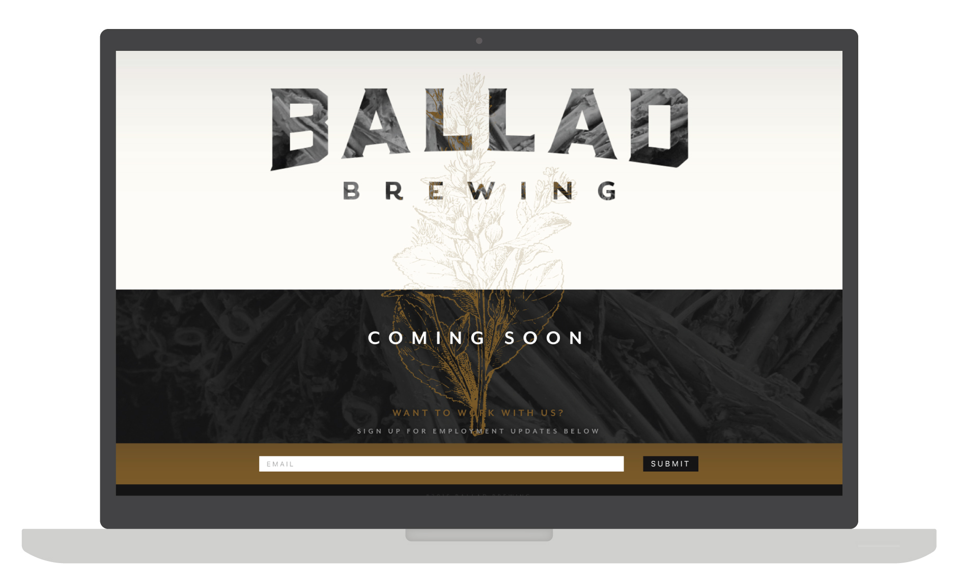
We put this simple splash page in place to help Ballad Brewing (Danville, VA) promote their brewery while we built out a more robust website.
-
2
Blog as a startup journal
We love when breweries document their start up journey, warts and all. That’s what makes craft beer so compelling—it’s a direct connection to an industrial practice, where you can watch people work hard to create something tangible and beautiful. This transparency is powerful.
By sharing photos and writing about where you are in the process, we’ve seen breweries build enormous buzz before they even finalized a location. Ideally, this blog would live on a larger website, though in a pinch, you can start a standalone blog to capture your progress using something like Tumblr, WordPress, or Medium.
If we had to choose between a simple blog and a lean, brand forward microsite (as consumers), we’d take the blog. All day. Or even better, a combination of the two. Or better yet, Option 3.
-
3
Robust, immersive website
This would be the most feature-rich option of the three. We’re not talking a bloated site full of cool functionality just for the sake of having it, but a fully fleshed-out website with multiple pages devoted to different elements of your business. These might include a page highlighting your brewers, photo galleries, an events calendar, beer finder, keg availability, blog, full social integration, and anything else you can dream up.
This site would serve as digital home base for all your communications. The larger you become (or hope to become), the more necessary something like this is. If you’re distributing regionally, for example, your website can be a great way of giving people who may not be able to visit your brewery a taste of the brewery experience.
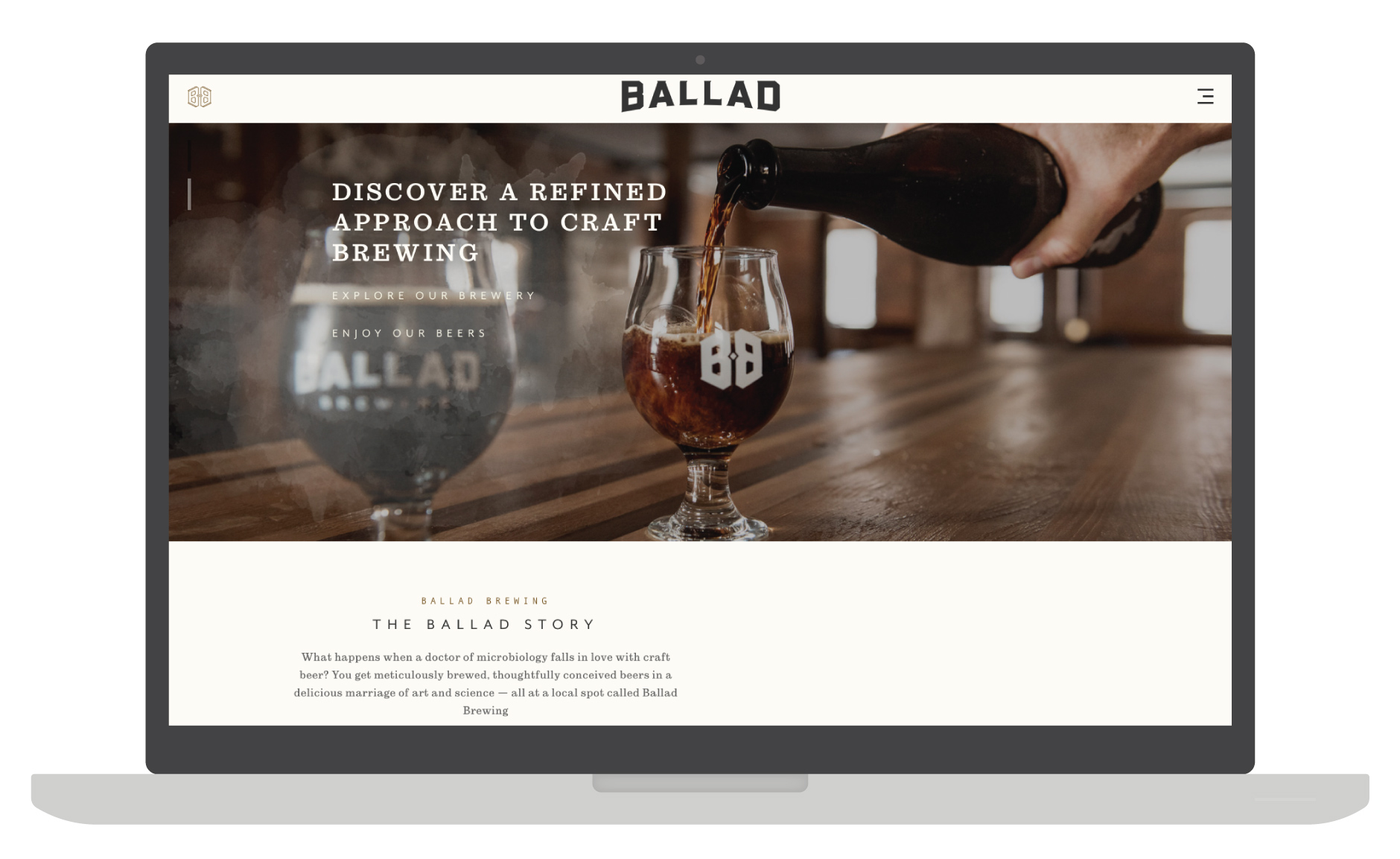
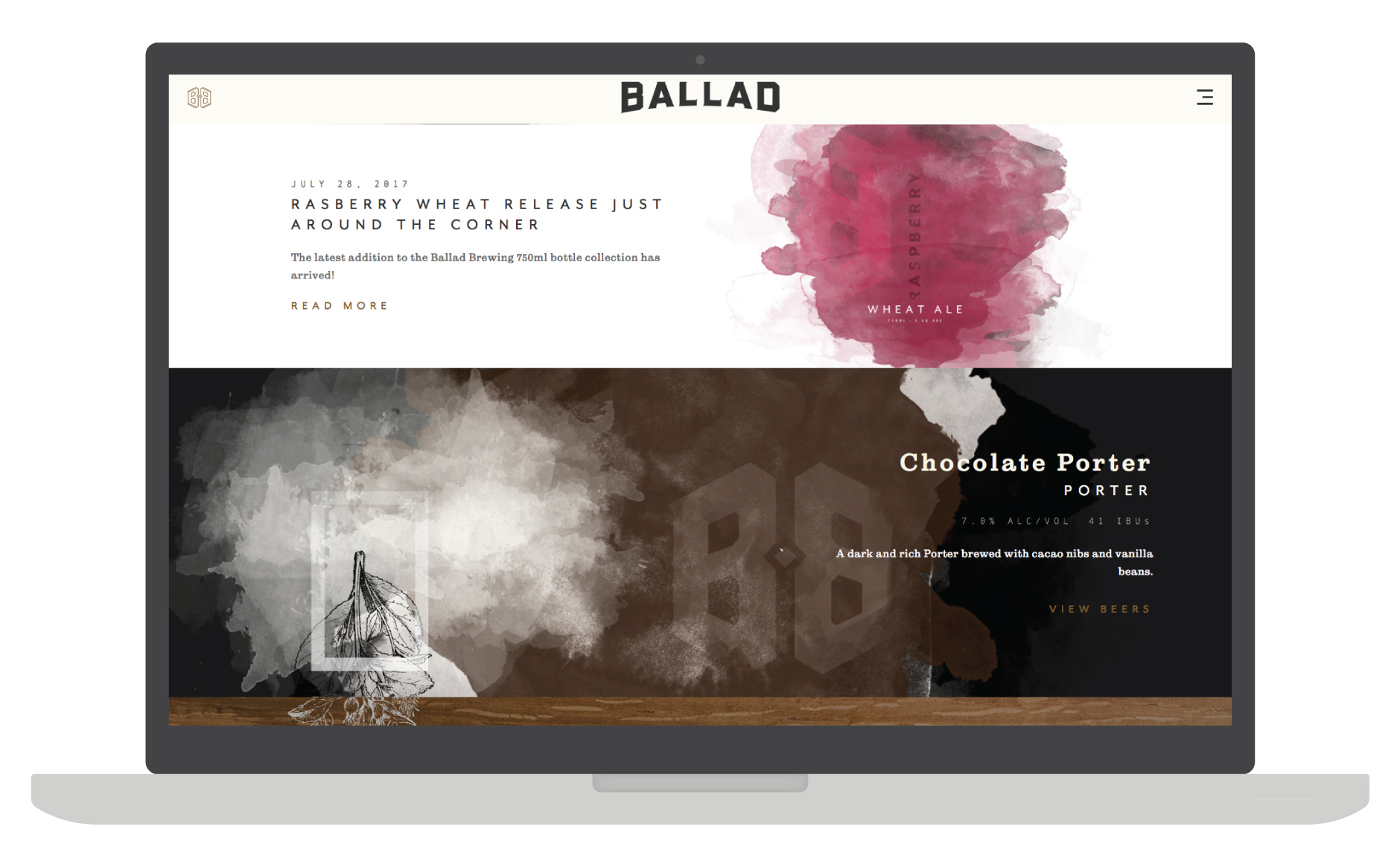
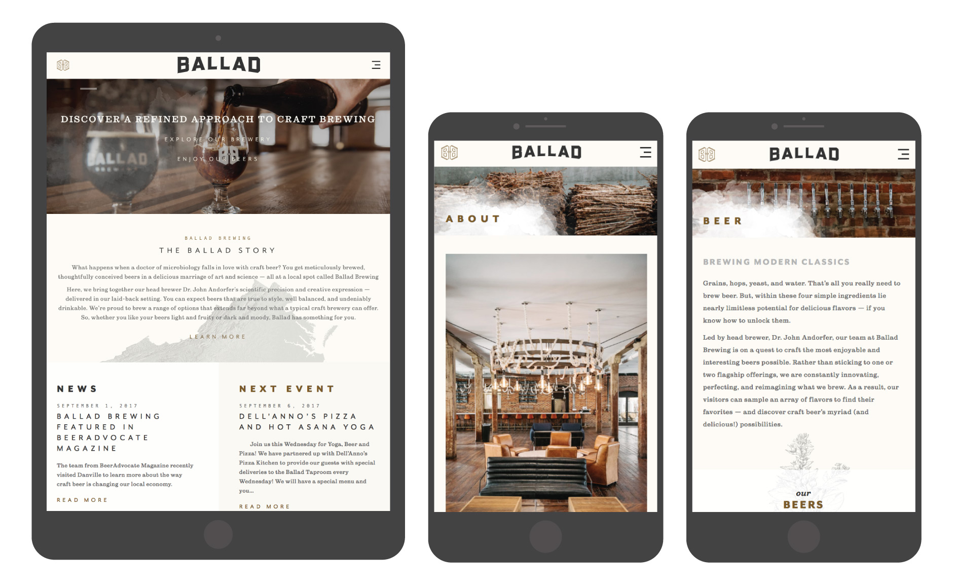
Here’s a robust, responsive website we designed for Ballad Brewing. See it live here.
Now let’s discuss what the web design process itself looks like. There will be differences between how one firm handles this process versus another, but this should give you a good idea of the major steps along the way. To make this easy, we’ll run you through our process.
-
1
COMPREHENSIVE SITE MAPPING & INFORMATION ARCHITECTURE
One of the most important steps in this entire process is determining what content (blog, beer descriptions, location lists, general about info, social media integration, etc.) you need on your site, and figuring out where it belongs. This all takes the form of a site map which, along with user testing and your brand foundation, will drive design and functionality considerations through the next phase.
-
2
ROUGH WEBSITE DESIGN
Some firms will make wire frames at this stage, though we never found them to be useful. Wire frames act as a rough sketch to determine what content will go where (imagine a page with a bunch of boxes strewn about).
Instead, we use the site map to jump straight into sketching a couple different options based on the outlined goals, art direction and brand foundation. We’ll generally present the home page and a few key secondary pages as well as some examples to give you a sense of how the site will look and feel across different devices (phone versus tablet versus desktop).
-
3
REVISIONS
After a direction is chosen, we take your feedback and refine the design into a near final form. With responsive web design, we also lay out the site across various “breakpoints”—the dimensions (or display resolution) of various screen sizes between big screens down to tablets and mobile phones. These breakpoints are determined by analyzing user display data from several sources to determine which resolutions are the most common now and in the immediate future.
Having a responsive website is extremely important because more and more people are experiencing your brand, and the internet itself, on phones and tablets. Optimizing your site to be fluid across different screen sizes makes for a more pleasant experience and can increase site visitors and sales.
-
4
DEVELOPMENTAL “DEV” SITE
Once the design is approved, we begin to develop the site in a development (or “dev”) environment. The site is hidden from search engines and only our team and you will know it exists. This allows us to refine and build a fully functional site before it ever goes live.
A fairly obnoxious problem (for you, the site owner, and us, the designers) is when you receive an email or tweet complaining about an issue someone found with your site. Building in a dev environment goes a long way to eliminate this issue with thorough browser compatibility testing in real time by everyone involved.
As we get close to launching your site, we run your team through a tutorial so you know how to update its content yourself, whenever you need to.
-
5
SITE LAUNCH!
Once everything is ready on the staging site, we migrate everything to the live domain for launch. We take care of other things like Google Search Console (how your site displays in Google Search results) and Google Analytics to monitor your site and inform future functionality considerations.
-
6
MONITOR & SERVICE AS NEEDED
It’s a good idea to regularly review your analytics to see how people are using your site. Is there a page that gets no visits? How about one that people spend several minutes on? Maybe there’s a call to action that’s not working as we had planned? This information can guide future content and design revisions.
From here, your site is out there in the wild telling your story, leaving you time to focus on more important things like brewing great beer and growing a herculean beard.
OTHER THOUGHTS
-
1
RESPONSIVE WEB DESIGN
Responsive web design means that your site automatically formats to fit whatever device someone is using. This means you get the same content on a desktop as you do on a tablet or smart phone, all in a pleasant, easy-to-use experience.
Whether you decide to go with a microsite, a startup journal, or an immersive experience, your website must be responsive. Even a lean microsite needs to work properly on smaller screens because people are no longer tolerant of non-responsive sites. If your site isn’t responsive, you’ll lose business without even knowing it.
-
2
A NOTE ON CONTENT MANAGEMENT SYSTEMS
As recently as a few years ago, businesses often had to pay design firms to update their site’s content. Adding a new seasonal beer to your beer page? An hour of billable time. Adding a new cellerman’s bio? An hour of billable time.
Those days are largely gone, due in large part to the rise of Content Management Systems (CMS). We’re big advocates of WordPress and build nearly every website that comes though our studio’s doors on its robust, user-friendly backend. This allows you to fully edit your site without needing to know anything about coding.
-
3
A NOTE ON TEMPLATES VS. CUSTOM DESIGNED SITES
We won’t lie and say that every brewery in the world needs a fully-custom designed website. Sometimes, a template can be a perfect solution to your design problem. However, templates can be a double edged sword—while they’re relatively cheap and easy to get up and running, there’s nothing to stop a brewery from down the street from using the same one (we’ve actually seen this happen). If the goal is total differentiation, then your site should make you stand out, not make you blend in.
If you’re working with a design firm on your website, be sure to ask whether or not they’re going to use a template. While a template may be a good solution for your brewery, paying a design firm an absurd amount of money to upload your logo and colors to one (when you could just as easily do it) is borderline unethical on the part of the designer, and definitely a waste of cash for you.
